Interior Trim Painting: Why Baseboards, Door Frames, and Crown Molding Need Different Treatment Than Walls

Nikolle Bauder • March 19, 2026

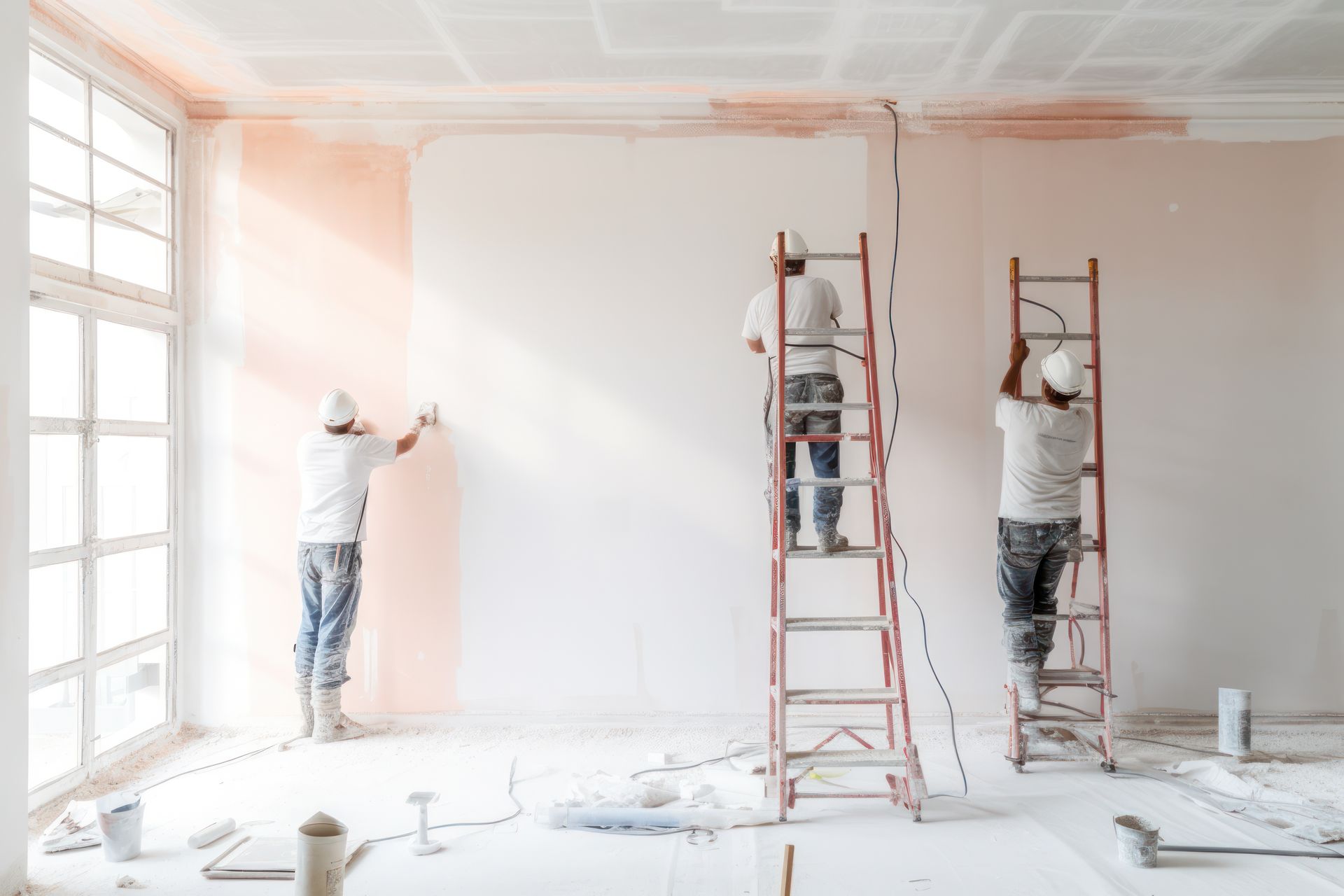
Walk into any freshly painted room and your eye goes to the walls first — the color, the coverage, the way the light hits the finish. But spend another thirty seconds in that room and something else registers, even if you can't immediately name it. The trim. The baseboards running along the floor, the casings framing every door and window, the crown molding where the wall meets the ceiling — these elements form the architectural skeleton of the room, and their paint condition communicates quality and craftsmanship in a way that walls alone never can. A room with perfectly rolled walls and poorly painted trim looks unfinished. A room with thoughtfully painted walls and trim that's crisp, smooth, and properly sheen-matched looks professionally done regardless of what else is in the space. Homeowners throughout Plano, Frisco, Richardson, Allen, McKinney, and the greater Dallas-Fort Worth area invest in interior painting expecting results that genuinely transform a room, and understanding why trim requires fundamentally different products, preparation, and technique than walls is what separates a result that delivers that transformation from one that falls just short of it.


Why Trim and Walls Are Not the Same Painting Problem


The instinct to treat trim painting as a simpler version of wall painting — same preparation, same products, smaller surface area — produces the most common interior painting disappointment we encounter. Trim and walls are not the same problem. They differ in substrate composition, surface stress, contact exposure, light interaction, and the performance standard they're held to, and every one of those differences requires a different decision in the painting process.


Walls in a typical North Texas home are drywall — a gypsum core with paper facing that provides a relatively consistent, moderately porous surface. Trim elements are wood, medium-density fiberboard, or some combination of both, and these materials behave completely differently under paint. Wood grain and MDF edges absorb paint at variable rates across the same surface, meaning that a product and technique adequate for walls will leave visible brush marks, uneven sheen, and grain telegraphing on trim surfaces where every imperfection is magnified by the directional light that rakes across these narrow, profiled elements throughout the day. Add to this the fact that trim surfaces are touched, bumped, scraped with furniture, and cleaned far more aggressively than walls, and you have surfaces that demand a harder, smoother, more chemical-resistant paint film than any standard interior wall product delivers.


The Product Decision That Determines Everything Else


Before brush technique, before prep sequence, before sheen selection — the single most consequential decision in an interior trim painting project is product chemistry. Standard latex interior paint, regardless of brand quality or price point, is not the correct product for trim. It produces an adequate film for walls where performance requirements are moderate and the surface is uniform. It produces a substandard result on trim where you need a harder cure, better leveling behavior, and resistance to the repeated contact and cleaning that baseboards and door casings receive in a lived-in Dallas-Fort Worth home.


The correct product category for interior trim in virtually every residential situation is a waterborne alkyd — sometimes called a hybrid alkyd or alkyd enamel. These formulations blend the chemistry of traditional oil-based paint with the practical handling properties of water-based products. The result is a paint that levels significantly better than latex while it's wet — meaning the wet film flows and self-smooths before skinning over, dramatically reducing brush marks — and cures to a substantially harder film than latex achieves at full cure. Products like Benjamin Moore Advance, Sherwin-Williams Emerald Urethane Trim Enamel, and comparable professional-grade waterborne alkyds are the industry standard for interior trim work for exactly these reasons. They clean up with water, dry to recoat in a reasonable timeframe, and produce a finish that matches the performance standard trim surfaces require.


In the DFW area, where low-humidity interior environments during air-conditioned summers and heated winters cause standard latex to skin over faster than in humid markets, the extended open time that waterborne alkyds provide is particularly valuable. That longer working window allows you to work through profiled edges, inside corners, and complex molding profiles without the drag marks and lap lines that develop when paint begins drying before you can complete a section.


Baseboards: The Most Abused Surface in Any Room


Baseboards occupy the most punishing position in a room — at floor level where they receive regular contact from shoes, furniture legs, vacuum cleaners, and mop heads, and where they're most likely to accumulate the scuffs, scrapes, and grime that require periodic cleaning with solutions strong enough to test paint adhesion. In North Texas homes, baseboards in high-traffic areas — hallways, kitchens, family rooms — can look visibly worn within two to three years of painting if the wrong product was used or if surface preparation was inadequate at the time of painting.


Proper baseboard preparation begins with cleaning. In existing homes throughout Plano and Richardson where baseboards have accumulated years of shoe polish, floor wax residue, cleaning product buildup, and general grime, a thorough degreasing with TSP or an equivalent cleaner is essential before any new coating goes on. Paint applied over a contaminated surface doesn't fail immediately — it fails at the first cleaning, when the new paint lifts away in sheets because the bond was never established with the actual substrate, only with the contamination layer sitting on top of it. After cleaning, scuff sanding with 220-grit creates mechanical tooth for the primer and first finish coat. Any areas where the existing paint has chipped, cracked, or lost adhesion need to be scraped to stable material and spot-primed before full coats go on.


One DFW-specific consideration for baseboard painting is the gap management at the floor line. In Texas homes with hardwood, tile, and luxury vinyl plank flooring — all of which are common throughout Frisco, Allen, and McKinney's newer construction — the caulk joint between the bottom of the baseboard and the flooring surface tends to crack and shrink under the thermal cycling that extreme Texas temperature differentials create between heated and cooled seasons. Re-caulking this joint with a paintable siliconized acrylic caulk before painting produces the crisp, sealed baseline appearance that distinguishes a professional result from a DIY one, and it prevents the moisture intrusion at the floor line that can compromise baseboard integrity in slab-on-grade homes common throughout the area.


Door Frames and Window Casings: Where Light Reveals Every Flaw


Door frames and window casings are where brush technique matters most and where inadequate prep shows most aggressively. These surfaces are narrow, profiled, and positioned adjacent to walls in a way that makes them subject to the harshest directional lighting in any room — the light streaming through windows and casting shadows across the face of every door casing in its path. That raking light is merciless with brush marks, roller stipple, drips, and surface imperfections in a way that broader wall surfaces are not, because the angle of shadow exaggerates every surface variation into visible relief.


Preparation for door and window casings in DFW homes requires particular attention to the history of the surface. In older homes throughout Plano and Richardson, casings may have accumulated four, five, or more layers of paint over decades, and the edges and inside corners of profiled casings accumulate these layers as thick ridges that need to be sanded or scraped back before new paint goes on. Painting over built-up paint edges creates a layered ridge effect that reads as a blurry, undefined profile — exactly the opposite of the crisp architectural line that properly painted casings deliver. A combination of chemical stripper at the thickest accumulation points and 150-grit hand sanding at the faces and edges brings the casing back to a workable surface profile that accepts new paint cleanly.


Application technique on door and window casings follows the fundamental rule of working profiles before faces: paint the inside corner where the casing meets the wall first, then the profiled face, finishing with tip-off strokes running the full length of the casing parallel to the wood grain. This direction of stroke is critical — brush marks running perpendicular to the casing's length are visible under raking light; marks running parallel to the length blend into the grain character and become invisible in the finished result.


Crown Molding: The Most Technically Demanding Trim Element


Crown molding sits at the intersection of ceiling and wall, occupying a visually prominent position in any room where it's present. It is also the most technically demanding trim element to paint cleanly because it requires cutting against two adjacent surfaces simultaneously — the ceiling above and the wall below — while managing paint on a profiled face that often includes multiple planes, ogee curves, and cove details that collect paint in recesses and go thin on ridges unless application is deliberately controlled.


The most common crown molding painting mistake is using too much paint at once. Crown profiles collect excess material in the cove of the molding and at the inside corner against the ceiling, and that excess runs downward onto the ceiling or outward onto the wall if not addressed immediately. The correct approach is thin coats applied with a well-loaded but not overloaded brush, working in manageable sections of two to three feet, completing each section with tip-off strokes before moving forward. On complex crown profiles with deep reliefs, a small detail brush is often necessary to work paint into the recessed areas after the main body of the profile has been coated.


In the Dallas-Fort Worth area, where newer construction in Frisco, Allen, and McKinney commonly features MDF crown molding, the substrate's edge-grain absorptivity creates additional challenge. The spring angle cut at the wall and ceiling faces of MDF crown is essentially end grain, and it will absorb paint aggressively unless sealed with a shellac-based primer before finish coats. Unsealed MDF crown edges look chalky and rough on the finish coat no matter how good the paint is, because the binder is being pulled into the fiber matrix rather than curing on the surface to form a smooth film. One coat of shellac primer on those cut faces eliminates this problem entirely and is the single most impactful step in a crown molding painting project.


Sheen Selection: The Decision That Ties the Room Together


The standard guidance for interior trim sheen is semi-gloss — a designation that covers an enormous range of actual sheen levels depending on brand and formulation. In a DFW home with abundant natural light from south and west-facing windows, true semi-gloss on trim reads very differently than it does in a north-facing room or a home in a less sun-intense market. Homeowners who have selected semi-gloss trim that looked right on a sample card and then experienced glare, harshness, or an institutional appearance at full scale in their Texas home have encountered this firsthand.


A more nuanced approach matches trim sheen to room character and light exposure. Satin finish on trim in formal living spaces and bedrooms provides the durability and cleanability that trim requires while maintaining a softer, more residential appearance under Texas's intense light. Semi-gloss is appropriate for trim in kitchens, bathrooms, laundry rooms, and children's rooms where aggressive cleaning and moisture exposure demand the harder film that higher sheen delivers. The key in either case is maintaining a meaningful sheen differential between walls and trim — enough contrast that the trim reads as a distinct architectural element rather than blending into the wall surface.


Let Hutch'N'Son Deliver the Trim Results Your Home Deserves


Interior trim painting done correctly is one of the highest-return investments in any residential painting project — it transforms a room's perceived quality and craftsmanship in ways that are immediately visible and enduringly satisfying. If you're ready to have the baseboards, door casings, window frames, and crown molding in your Plano, Frisco, Richardson, Allen, McKinney, or greater DFW home painted with the preparation discipline, product knowledge, and technique precision that this work demands, Hutch'N'Son Painting is ready to deliver. With over 40 years of experience working in North Texas homes, we know exactly what these surfaces require and how to execute them to a standard that makes the whole room look right. Contact us today to schedule your free estimate. Your trim deserves better — and we're here to prove it.

By Nikolle Bauder March 9, 2026
The home office has become one of the most consequential rooms in a Dallas-Fort Worth home, and for a growing number of Plano, Frisco, Richardson, Allen, and McKinney residents, it's also one of the most permanent. What began as a temporary arrangement for many families has settled into a long-term reality — a dedicated room where productivity, focus, and mental clarity need to show up reliably every workday. Most homeowners who set up a home office invest considerable thought in the desk, the monitor setup, the chair, and the lighting fixture. Very few invest the same deliberate attention in the paint color on the walls surrounding all of that equipment, even though color is one of the most potent and least expensive environmental variables affecting cognitive performance and mood in any workspace. In a region where North Texas sunlight pours through windows with an intensity and angle unlike almost anywhere else in the country, getting that color decision right requires understanding both the neuroscience of color and the specific optical behavior of DFW's light — because a color that promotes focus beautifully in a Seattle office can produce fatigue, glare, or an atmosphere of restless anxiety in a south-facing Plano study. Why Color Affects Cognitive Performance — and Why It's Not Just Preference Color preference and color performance are two entirely different things, and confusing them is the most common mistake homeowners make when choosing a home office paint color. You might personally prefer warm, rich tones — deep burgundies, saturated golds, warm chocolates — and those colors may make you feel comfortable and at ease in a living room or bedroom. But comfort and cognitive performance are not the same neurological state, and paint colors that promote relaxation actively work against the alertness, sustained attention, and working memory performance that a productive workday demands. The research on color and cognition has become substantially more refined over the past two decades. Studies in environmental psychology have established that mid-value blues and blue-greens consistently support sustained attention tasks — the kind of deep focused work that characterizes knowledge work, writing, analysis, and design. Soft, desaturated greens support accuracy and careful, methodical work, partly because green sits at the center of the human visual spectrum and requires the least muscular adjustment from the eye to bring into focus, reducing the subtle visual fatigue that accumulates over a full workday. Warmer tones in the yellow-orange family stimulate creative and generative thinking — brainstorming, ideation, lateral problem-solving — but at higher saturation they also elevate cortisol and increase the likelihood of distraction and restlessness. Highly saturated versions of any color, including bold reds, vivid yellows, and intense greens, produce stimulation levels that are counterproductive for sustained focus regardless of the specific hue. What this means practically for a DFW homeowner designing a home office is that the most productive color palette is almost never the most visually dramatic one. The colors that perform best cognitively tend to be mid-value, slightly desaturated versions of blue, blue-green, soft green, or warm neutral — colors that feel deliberate and refined rather than bold and expressive. How Light Rewrites the Rules Understanding color science is the necessary foundation for a home office color decision in the Dallas-Fort Worth area, but applying that science without accounting for DFW's specific light conditions will still lead you astray. North Texas sits at a latitude and in an atmospheric environment that produces natural light with characteristics meaningfully different from the coastal, northern, or Pacific environments where much of the color guidance homeowners encounter online was developed. DFW receives an average of 234 sunny days per year, with a sun angle and intensity that produces light with a strong warm-yellow to neutral color temperature for most of the day. This is significantly different from the cool, blue-shifted diffuse light characteristic of the Pacific Northwest or the Northeast, where the same paint colors are photographed for the shelter magazines and websites that most homeowners use for color inspiration. A soft blue that looks sophisticated and calming in a Portland home office — where cool, diffuse light maintains the color's cool undertone throughout the day — can look distinctly purple-gray or lavender in a DFW home office where the warm North Texas sunlight shifts the color's perceived undertone toward its violet component. A warm greige that looks grounded and neutral in a north-facing New England room can read orange or pink in a south-facing Frisco office where intense afternoon sun amplifies every warm undertone in the paint. The practical implication is that color decisions for a DFW home office must be made by testing samples on the actual walls of the actual room, observed at multiple times of day under both natural and artificial light, before committing to full coverage. A two-inch sample card evaluated under fluorescent store lighting will not tell you what that color does in your specific office at 3 p.m. on a summer afternoon when the west-facing window is pouring in full Texas sun. South- and West-Facing Offices: Managing Intensity Without Losing Atmosphere In the DFW metroplex, south-facing and west-facing home offices receive the most intense and warmest natural light, and this exposure profile has specific implications for color selection. Warm undertones in paint colors are amplified by warm light — meaning a paint that reads as a balanced warm gray under morning light will shift noticeably toward tan, beige, or even orange by mid-afternoon as the sun's angle intensifies. Colors with strong blue or green undertones fare better on these exposures because the warm light partially neutralizes the cool undertone, producing a balanced, grounded appearance rather than the slightly clinical effect those same colors can develop in less light-intense environments. For south- and west-facing offices, consider blue-greens and soft teal-adjacent tones in a mid-to-light value range. Colors in the Benjamin Moore family like Buxton Blue, Sea Salt, or Quiet Moments, or their Sherwin-Williams equivalents in the Reflecting Pool and Quietude family, maintain their integrity through DFW's afternoon light far better than pure cool blues that can shift uncomfortably toward purple. Warm whites with distinctly neutral undertones — avoiding anything with a pronounced yellow or pink cast — work well as accent walls or as the color on a single wall behind a monitor, where their light-reflective properties reduce eye strain without contributing the color fatigue that saturated walls can produce. North-Facing Offices: Where You Can Be Bolder North-facing home offices in the DFW area receive indirect, relatively consistent light throughout the day — cooler in quality than south or west exposures, and lower in intensity than any other orientation. This is actually the most forgiving exposure for home office color selection because the cooler, more diffuse light doesn't amplify warm undertones the way direct sun does, giving you more latitude to use warmer tones that would look overpowering in a south-facing room. A north-facing office in a Plano or McKinney home is one of the few situations where a warm sage green, a soft terracotta-adjacent neutral, or even a rich putty tone can perform beautifully — delivering the warmth and psychological comfort that makes a room feel pleasant to spend a full workday in without the intensity problem those colors create under direct Texas sun. The one pitfall to navigate on north-facing exposures is that truly cool colors — pure blues, cool grays, and blue-greens at low value — can feel cold and slightly dreary in a room that receives no direct sunlight, particularly during DFW's winter months when the sun angle is lower and indirect light is even more subdued. Adding warmth through the paint color compensates for what the light doesn't naturally provide. The Ceiling and Trim Decisions That Complete the Productivity Environment Home office color selection often stops at the four walls, but the ceiling and trim colors in a workspace contribute meaningfully to the cognitive environment and deserve deliberate choices rather than defaults. Standard flat white ceilings are appropriate in most home offices, but the specific white matters more than homeowners typically realize. A ceiling white with a pronounced cool undertone in a warm-toned office can feel discordant — the visual contrast between a warm wall and a blue-white ceiling creates a tension that registers as subtle discomfort even when you can't identify its source. Matching the ceiling white's undertone to the dominant undertone of the wall color — warm-white ceiling with warm walls, neutral-white ceiling with cool or neutral walls — produces a cohesive environment where every surface works in the same tonal direction. Trim color in a home office has a functional dimension beyond aesthetics. Bright, pure white trim against a mid-value wall color creates high contrast that makes the room's architectural edges visually sharp and stimulating. In a bedroom or living room, this contrast reads as clean and classic. In a workspace where you'll spend hours each day, that edge contrast contributes to visual fatigue in ways that are subtle but cumulative. A trim color that's a step or two warmer or softer than bright white — a linen, an antique white, or a warm off-white — reduces that edge contrast while maintaining the visual differentiation between wall and trim that gives a room its sense of finish and detail. The One-Color-Plus-Accent Framework for DFW Home Offices The most consistently successful approach for home office color in the DFW area is a framework that treats the room's dominant wall color as a single, carefully chosen mid-value tone and uses one accent wall — typically the wall behind the primary seating position or the wall opposite the main desk — as an opportunity for slightly more visual interest or depth. This accent can be a slightly deeper value of the dominant color, a complementary tone that shares the same undertone family, or a textured treatment like board and batten or shiplap painted in a contrasting but coordinated shade. What this framework avoids is the all-four-walls-in-the-same-saturated-color mistake that produces an immersive color experience appropriate for a restaurant or retail environment but overwhelming for eight-hour work sessions. Color at full saturation on all four walls of a home office creates a phenomenon called color fatigue — the visual system adapts to the dominant hue, and after extended exposure, attention and focus performance measurably decline. Reducing saturation, limiting the deepest color to a single wall, and using the remaining three walls in a lighter value of the same hue or a complementary neutral gives the visual system relief while maintaining the character and atmosphere that makes a dedicated office feel like a considered, intentional space. Let Hutch'N'Son Help You Create a Workspace That Works as Hard as You Do The right color in a home office isn't just aesthetically pleasing — it actively supports the focus, energy, and sustained attention that productive work demands. If you're ready to transform your home office in Plano, Frisco, Richardson, Allen, McKinney, or anywhere across the greater Dallas-Fort Worth area with colors and products selected specifically for North Texas light and your room's unique exposure, Hutch'N'Son Painting is ready to help. Our team brings over 40 years of experience working with DFW's demanding light conditions, and we'll walk you through color testing, sheen selection, and product choices that deliver a workspace that performs beautifully from the first morning light to the last evening hour. Contact us today to schedule your free estimate.
By Nikolle Bauder March 3, 2026
It seems like a straightforward question until you're standing in a freshly prepped room holding a brush and realizing you have four different surfaces that all need paint, no clear starting point, and a genuine concern about messing up the work you've already done. The order in which you paint a room is one of those decisions that feels arbitrary until you get it wrong — and then it becomes immediately, frustratingly obvious why sequence matters. Homeowners throughout Plano, Frisco, Richardson, Allen, McKinney, and the greater Dallas-Fort Worth area contact us regularly after DIY interior paint projects that produced decent color but left them with trim paint on freshly rolled walls, ceiling edges bleeding into wall colors, and touch-up work that multiplied with every fix. Almost every one of those situations traces back to painting in the wrong order. The correct sequence isn't complicated, but it requires understanding the logic behind it rather than just following a checklist — because once you understand why the steps fall where they do, you can adapt intelligently to whatever your specific room presents. The Foundational Principle: Work From the Top Down and From Rough to Refined Every decision in the professional painting sequence flows from two principles that work together. The first is gravitational: paint drips, spatters, and roller spray travel downward. If you paint surfaces from top to bottom, every step you take deposits any overspray and drips onto surfaces you haven't painted yet, which means those mistakes get covered automatically by subsequent work rather than landing on surfaces you've already finished. The second principle is about surface refinement: paint the surfaces that can tolerate some overspray from adjacent work before painting the surfaces that require precision. Ceilings can accept a small amount of wall paint at their edges because that edge gets covered when you paint the wall. Walls can accept a small amount of trim drip at the baseboard because the baseboard paint covers that contact line. The sequence is self-correcting when you follow it in the right direction — and self-defeating when you reverse it. These two principles collapse into a single rule that professional painters throughout the DFW area have followed for decades: ceiling first, walls second, trim last. Every variation and nuance in the process descends from that structure. Before Any Paint Opens: The Prep Phase That Determines Everything The sequence doesn't begin with paint. It begins with preparation, and preparation done correctly across all surfaces before a single can is opened is dramatically more efficient than prepping each surface just before you paint it. Walk the entire room and address every repair — nail holes, drywall dings, hairline cracks at corners, tape seams that have lifted — across the ceiling, all walls, and all trim in a single pass. Sand those repairs smooth. In North Texas homes, particularly the older ranch-style properties in Plano and Richardson that have accumulated decades of paint layers, pay attention to ridges at the edges of old patches that have built up over multiple repaints. Those ridges telegraph through new coats as visible lines under raking light, and they need to be feathered flat before painting begins. Clean all surfaces with a degreasing solution before painting, especially in rooms adjacent to kitchens or in older DFW homes where years of HVAC cycling has deposited a fine layer of dust and airborne cooking residue on walls that may not look dirty but will prevent proper adhesion at a microscopic level. Tape off window glass, door hardware, and any surfaces that need protecting from overspray, and remove outlet and switch plate covers entirely rather than cutting around them — the result is always cleaner, and the time savings from not correcting paint on cover plates exceeds the time spent removing them. Priming Strategically: Not Everything Needs It, But Some Things Desperately Do Primer belongs in the sequence after prep and before paint, but the mistake many homeowners make is treating it as a uniform first coat for every surface in the room regardless of that surface's actual condition. Strategic priming means applying it specifically where the substrate requires it — over patched and repaired areas where joint compound creates a different absorption rate than the surrounding painted surface, over stains from water damage or smoke that will bleed through any number of finish coats without a proper stain-blocking barrier, over surfaces being painted dramatically lighter after years of a darker color, and over any bare drywall or unfinished wood exposed during repairs. In the Dallas-Fort Worth climate, water stains deserve particular attention during the priming phase. DFW homes experience periodic roof damage from hail storms and heavy rain events, and the resulting ceiling and wall stains are among the most common surface problems we encounter. Standard latex primer will not reliably block water stains — it takes a shellac-based or oil-based stain blocker to chemically seal those mineral deposits before finish coats go on. Applying standard primer over a water stain and then covering it with two coats of ceiling white produces a stain that reappears within weeks as the water-soluble compounds migrate upward through the wet finish coat. This is one of the most preventable paint failures in residential work, and catching it at the priming stage rather than discovering it after the room is complete saves significant time and material cost. Step One: The Ceiling First, Always — Here Is the Exact Reasoning With prep and priming complete, the ceiling receives the first coat of finish paint. The reasoning is simple and absolute: rolling a ceiling generates fine mist and occasional drips that fall downward onto the walls below. If the walls are already painted, that overspray is a problem requiring cleanup and touch-up that introduces sheen variation at every corrected point. If the walls haven't been painted yet, the overspray is irrelevant — it gets covered when the walls are rolled. Ceiling paint is invariably a flat or matte finish that hides roller stipple and minor surface texture, and it should be applied in two directions with overlapping passes to ensure uniform coverage without banding. Cut in at the ceiling perimeter with a brush before rolling — running a band of paint two to three inches out from the ceiling-wall junction — but don't agonize over perfect precision at that junction during this step. Small amounts of ceiling paint that drift onto the upper wall surface will disappear entirely when the wall color is applied. The goal at the ceiling stage is complete, even coverage on the ceiling plane itself, not an exhibition-quality perimeter cut line. One DFW-specific note: in Texas homes with tall ceilings — the vaulted great rooms and two-story entries common in Frisco, Allen, and McKinney's newer subdivisions — ceiling work requires extension poles and sometimes scaffolding for sections above standard reach. The physics of painting at extended heights changes how much roller pressure you can apply and how paint distributes across the surface. Work in smaller sections and maintain consistent pressure throughout each pass to avoid banding that becomes visible under the broad light distributions these large ceiling planes receive. Step Two: Walls — Technique That Eliminates the Most Common Problems After the ceiling is complete and dry, the walls receive their first coat. Cut in at the ceiling line, in the vertical corners where walls meet, and along the top edge of the baseboard and door and window casings — but keep your cut-in band relatively narrow, two to three inches, rather than trying to cut in the entire wall height with a brush. A wide cut-in band dries before you can roll back into it, creating a visible seam where brush-applied paint meets roller-applied paint with a slight sheen and texture difference that shows under raking light. In Texas, where summer air conditioning keeps interior humidity relatively low and accelerates latex drying, this cut-in-to-roller timing becomes even more critical than it is in humid climates — move promptly from cut-in to rolling each section rather than cutting in the entire room before picking up the roller. Roll walls from ceiling to floor in overlapping passes using a consistent nap roller appropriate to your wall texture. North Texas homes frequently feature orange peel, knockdown, or light skip trowel texture on drywall, and these textured surfaces require a slightly thicker nap — typically three-eighths to one-half inch — to deposit paint into the texture valleys without leaving peaks unpainted that show as a speckled pattern on the finished wall. Two coats are standard for most wall applications, and assessing coverage between coats should always be done on fully dry paint rather than wet paint, which reads thinner and more transparent than it will once cured. Step Three: Trim Last — The Decision That Changes Everything About Touch-Up Work Painting trim last is the step that most separates professional results from amateur ones, and it is consistently the step most homeowners reverse out of intuition. The instinct is to paint the crisp white trim lines first and then fill in the wall color carefully around them. The professional approach is exactly backward, for a reason that becomes clear the moment you think about the physics of brushwork on narrow surfaces. Applying paint to baseboards, door casings, window casings, and crown molding requires brush pressure at edges that inevitably pushes small amounts of trim paint onto the adjacent wall surface. If the wall is already painted and that semi-gloss trim paint lands on your eggshell finish, you have a sheen discrepancy at that contact point that is visible under the directional light that North Texas afternoons pour through south and west-facing windows. Correcting it requires careful touch-up that introduces its own subtle sheen variation. If you paint trim last and the same contact occurs — a small amount of semi-gloss landing on the wall adjacent to a baseboard — you simply touch that point with a small amount of wall paint on a brush or small roller once the trim has dried, and the eggshell correction blends invisibly into the surrounding wall. The math strongly favors trim last every time. Within trim, follow the top-to-bottom rule internally: crown molding first if present, then door and window casings, then baseboards. Any drips from crown work fall onto casings and baseboards that haven't been painted yet; any drips from casings fall onto baseboards below them. The sequence is self-cleaning at every level. The Often-Overlooked Final Step: Doors Interior doors, if being painted in the same project, follow the trim sequence and come last. Remove all hardware before painting — hinges, knobs, and strike plates — rather than attempting to cut around them. Paint door faces in thin, even coats using the same waterborne alkyd or premium trim enamel used on the rest of the trim for a consistent sheen match throughout the room. Prop doors open during drying and for at least 24 hours after the final coat to prevent the freshly painted surfaces from bonding together at the door-to-frame contact points, which is an easy problem to avoid and a frustrating one to repair after the fact. Dry Time Versus Cure Time: The 30-Day Reality Every Homeowner Should Know Paint is dry to the touch within one to four hours. It is fully cured — meaning the film has reached maximum hardness and chemical resistance — in approximately 30 days. During those 30 days, scrubbing, aggressive cleaning, or placing furniture in contact with painted surfaces risks marring the finish because the film is still hardening. This matters most for trim, where baseboards and casings are most likely to receive accidental contact from moved furniture, door hardware being reinstalled, or cleaning during the settling-in period after a paint project. Treating fresh paint surfaces gently for the first month protects the quality of the work just as much as the sequence used to apply it. Let Hutch'N'Son Get It Right the First Time A paint job that follows the right sequence from prep through final coat produces results that last, look clean from every angle, and don't require the endless round of touch-ups that out-of-sequence work generates. If you're ready to have a room — or an entire home — painted in Plano, Frisco, Richardson, Allen, McKinney, or anywhere across the greater Dallas-Fort Worth area with the precision and experience that over 40 years in North Texas homes delivers, Hutch'N'Son Painting is ready to help. We bring the product knowledge, the preparation discipline, and the sequencing expertise that turns a painting project into a finished result you're genuinely proud of. Contact us today to schedule your free estimate and let us get it done right the first time.
By Nikolle Bauder February 28, 2026
If you've ever repainted your home's exterior in a color you loved only to watch it wash out into something unrecognizable within a few years, you're not imagining things and you're not alone. Dallas-Fort Worth delivers some of the most punishing UV conditions residential paint can face anywhere in the continental United States, with south-facing and west-facing walls absorbing solar radiation intense enough to break down pigment molecules at an accelerated rate that homeowners in milder climates simply never experience. The color you choose for your home's exterior matters beyond aesthetics — it directly determines how quickly your investment fades, how soon you'll need to repaint, and whether your home maintains its curb appeal or slowly bleaches into a shadow of what you originally envisioned. After four decades of painting homes across Plano, Frisco, Richardson, Allen, McKinney, and the greater DFW area, we've watched certain colors age gracefully under the Texas sun while others deteriorate so predictably we can almost set a clock by them. The Science Behind Why Texas Sun Destroys Certain Colors Understanding why some colors fade faster starts with how pigments interact with ultraviolet radiation at the molecular level. Every paint color gets its hue from pigment particles suspended in the binder system, and those pigments fall into two broad categories — organic and inorganic — that respond to UV exposure in fundamentally different ways. Organic pigments, derived from carbon-based compounds, produce the most vivid and saturated hues but possess complex molecular structures inherently vulnerable to UV radiation that literally breaks apart the chemical bonds giving them color. Inorganic pigments, made from mineral-based compounds like iron oxides and chromium oxide, produce earthier tones but possess molecular structures far more resistant to photodegradation. North Texas compounds this chemistry with geography. The DFW metroplex receives intense direct sunlight roughly 234 days per year, and characteristically low humidity means fewer clouds filtering UV before it reaches your walls. A south-facing wall in Plano absorbs substantially more cumulative UV energy annually than an identical wall in Chicago or Seattle, meaning pigment degradation that takes eight years in the Midwest can happen in three to four here. The Colors That Fade Fastest and Why Bright reds consistently top the list of fastest-fading exterior colors in the DFW area, and the reason traces directly to pigment chemistry. The organic pigments producing vibrant red hues — particularly those in the quinacridone and naphthol families — absorb UV wavelengths at exactly the frequencies that destabilize their molecular structure. A bold red front door or accent wall that looked stunning at installation can shift noticeably toward a washed-out pink or dull brick tone within two to three years on a sun-exposed surface. Vivid yellows face a similar fate, as the organic pigments creating bright, warm yellows break down rapidly under sustained UV bombardment, fading toward a chalky cream that bears little resemblance to the original selection. Deep blues present an interesting case — pure organic blue pigments fade significantly, but blues formulated with phthalocyanine-based pigments actually demonstrate moderate UV resistance, meaning the specific product formulation matters as much as the color family itself. Dark greens and deep purples round out the high-fade category, with both relying on organic pigment blends that degrade unevenly under UV stress, often producing blotchy, inconsistent fading patterns rather than the uniform shift lighter colors experience. Colors That Hold Up Best Under Texas Conditions The most fade-resistant exterior colors share a common trait: they rely primarily on inorganic pigments that shrug off UV radiation rather than succumbing to it. Earth tones built around iron oxide pigments — warm tans, terracottas, sage greens, and warm grays — maintain their appearance remarkably well across DFW's demanding conditions because iron oxide is one of the most UV-stable pigments available in residential paint. These aren't accidental survivors; iron oxide compounds have literally weathered millions of years of solar exposure in natural rock formations, and that geological durability translates directly into paint performance. Whites and very light neutrals also resist visible fading exceptionally well, though for a different reason. Their primary pigment — titanium dioxide — is intrinsically UV stable, and because the color is already at the lightest end of the spectrum, any minor pigment degradation that does occur produces no perceptible color shift. Soft blues in the gray-blue or slate family perform surprisingly well because premium formulations use inorganic pigment blends rather than the pure organic pigments that make vivid blues vulnerable. The key insight for DFW homeowners is that fade resistance correlates strongly with how "earthy" or "muted" a color reads — the more a color looks like it could exist naturally in stone, clay, or mineral deposits, the more likely it relies on inorganic pigments that will hold their appearance through years of Texas sun. The Role Paint Quality Plays in Fade Resistance Pigment chemistry tells only part of the story, because the binder system protecting those pigments varies enormously between products and directly influences how long any color holds its appearance. Premium exterior paints incorporate UV-absorbing additives — compounds functioning essentially as sunscreen for your paint film — that intercept ultraviolet radiation before it degrades underlying pigments. These additives don't prevent fading entirely, but they dramatically slow the process, often doubling the functional color life of vulnerable hues compared to budget formulations. The binder itself matters too. One-hundred-percent acrylic resin systems maintain film integrity through DFW's extreme thermal cycling, keeping pigment particles properly encapsulated. Vinyl-acrylic blends in economy paints break down faster under UV stress, exposing pigments to direct photodegradation sooner and creating the chalky surface texture signaling a system in decline. Spending an additional fifteen to twenty dollars per gallon on premium product with proven UV-stabilizer packages pays for itself by extending your repaint cycle two to four years — making budget exterior paint one of the most expensive choices a DFW homeowner can make. Why Orientation and Shade Change Everything Two homes on the same Plano street painted identically can fade at dramatically different rates depending on sun exposure, and understanding this helps homeowners make smarter color decisions wall by wall. South-facing and west-facing walls absorb the most intense UV radiation, with west-facing surfaces taking the heaviest punishment because they receive direct afternoon sun during peak hours when atmospheric filtering is minimal. North-facing walls receive almost exclusively indirect light, making them far more forgiving of vibrant color choices that would wash out quickly on opposite exposures. Mature tree canopy provides meaningful UV protection, which partly explains why homes in Plano's older neighborhoods with established live oaks often maintain exterior color better than equivalent homes in newer Frisco and McKinney subdivisions where young landscaping offers minimal shade. Homeowners willing to vary color intensity by exposure — using bolder accents on shaded north-facing walls while selecting fade-resistant tones for sun-hammered south and west exposures — can achieve visual interest without committing vulnerable surfaces to colors destined to disappoint. The Fading Versus Chalking Distinction Homeowners Should Know Many DFW homeowners describe their exterior paint as "faded" when the actual failure mechanism is chalking — a related but distinct form of surface degradation that requires different corrective action. True fading involves pigment molecule breakdown that permanently alters color, while chalking occurs when the paint's binder deteriorates at the surface and releases loose pigment particles that form a powdery residue you can rub off with your hand. Chalking makes colors appear lighter and duller in ways that mimic fading, but unlike true pigment loss, chalked surfaces often retain their original color underneath the degraded surface layer. Running your palm across the paint surface provides a quick diagnostic — if your hand picks up a powdery residue matching the paint color, you're seeing chalking rather than pure fading. This distinction matters for repainting because chalked surfaces require thorough cleaning and sometimes specialized primer to ensure proper adhesion, while truly faded paint that hasn't chalked may need only cleaning and fresh topcoats. Either way, the deterioration signals that your exterior paint system has exhausted its protective capacity and needs professional attention before moisture begins penetrating compromised film to damage the substrate beneath. Choosing Wisely Saves Money for Years to Come Your exterior paint color is one of the few home improvement decisions that either compounds its value or accelerates its own obsolescence depending entirely on how well it matches the environmental reality of North Texas. The homeowners who maintain the best-looking exteriors in DFW aren't necessarily repainting more often — they're selecting colors and products engineered to resist the specific UV conditions their walls face daily, and they're making those choices with professional guidance rather than picking colors from a fan deck without understanding how they'll perform three summers from now. When you're ready to choose an exterior color strategy built for the realities of Texas sun, Hutch'N'Son Painting brings over forty years of firsthand knowledge watching how every color family performs across DFW's toughest exposures. We help homeowners select colors they'll still love years from now, recommend product systems with proven UV protection, and deliver the meticulous surface preparation and application that gives premium paint the foundation it needs to perform at its best. Contact Hutch'N'Son Painting today to schedule your free estimate and let our team help you make a color investment that looks as good in year five as it does on day one.
Show More